Project Name (if applicable, otherwise just type n/a)
WESO ARUs
Question
Hello! I am part of a Government of BC research team using EpiCollect to keep track of locations of interest in the field. When zoomed out in ‘Cluster’ view, the pins display themselves as pie charts, color-coded by the field of interest. However, when viewing individual pins, rather than clusters, the color coding disappears. Would this be possible to implement? Our current workaround is to download the data as a CSV, then map it up and apply color coding in GIS software. If EpiCollect accepts pull requests on Github, I don’t mind trying to do this myself.
Many thanks!
I confirm I have read the User Guide at docs.epicollect.net
on
I confirm I have searched for an answer in this community.
on
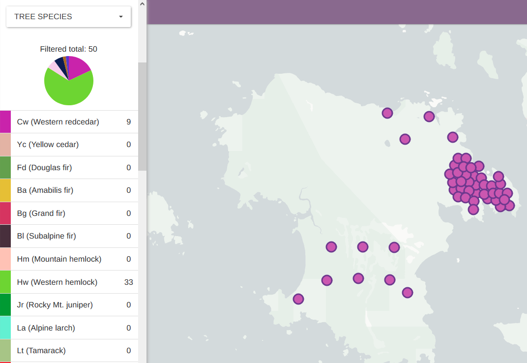
Color coded clusters:
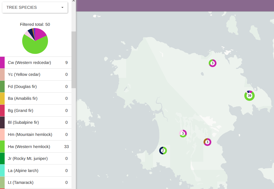
Color coding disappears when viewing data as individual pins: